What follows is an ongoing inventory of visual strategies for narrative approaches to the form of the archive: it’s an incomplete survey of exhibition design, artwork, and topical programming that provides inspiration for using the 1939 World’s Fair archive as locus for catalyzing new work. Beyond exhibition or display of selections, the artists and designers I make note of here demonstrate how can one make work both from the archive and of the archive—resonating with formal implications in its materials, ideas, structures, and relationships.
Exhibition
Archival exhibitions are an obvious way to orchestrate multiple objects and concepts into an edited, multivalent, spatialized narrative. The New York Public Library’s You Say You Want a Revolution and the NYPL Schomburg Center’s Black Power were both splendid exhibits displaying graphic works and documents from the Library archive. Both exhibitions acknowledged historical reverberations between past and present.
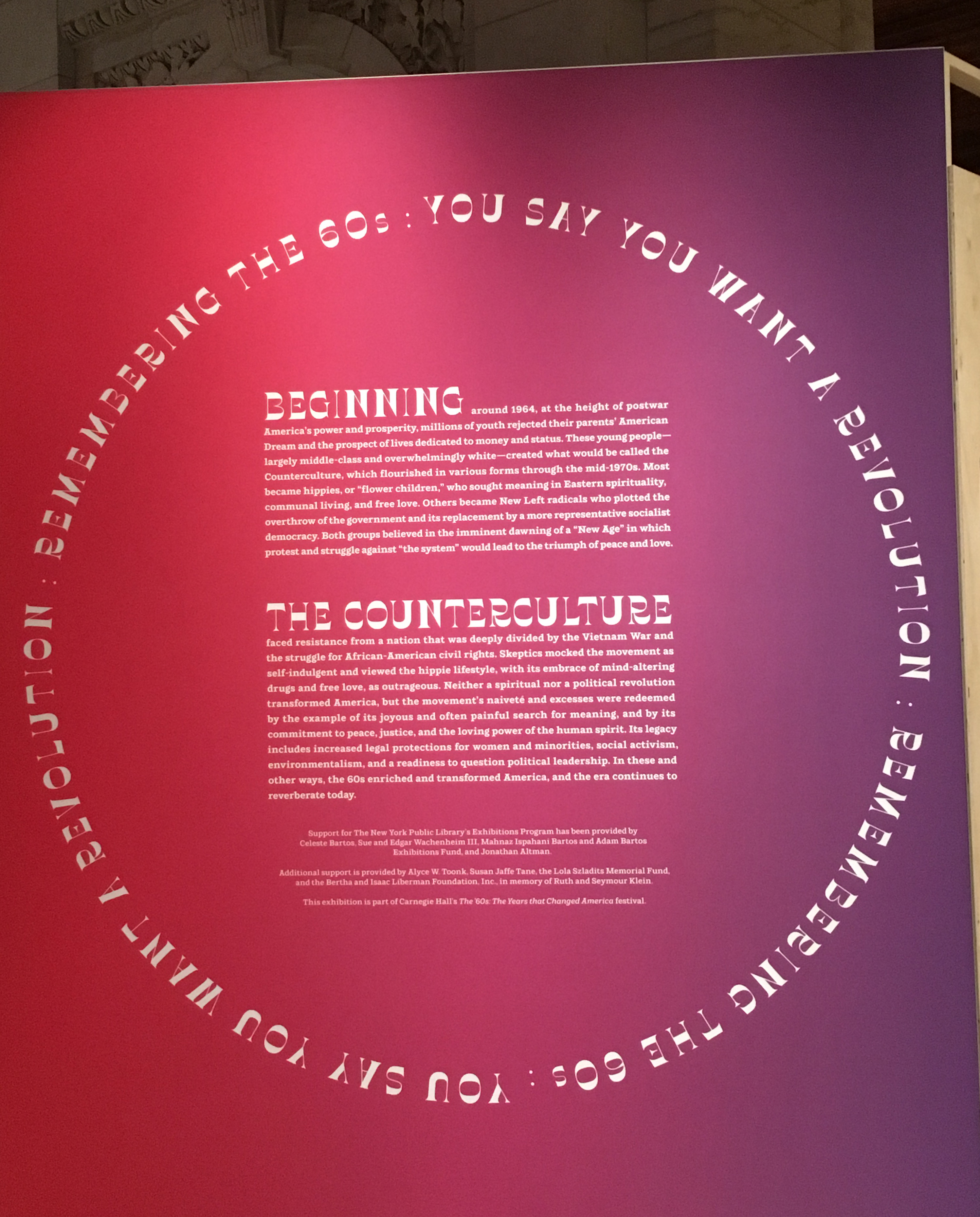
The exhibition graphics and circular path of the installation layout were striking, and a smart graphic interpetation of ‘revolution’ (what goes around comes around, in the same way that the issues of 1939 continue to reverberate today.)
A full range of archival material was displayed from from documents, letters, and broadsides to posters and election buttons. Informative wall texts provided context without overwhelming the already heavily graphic display.
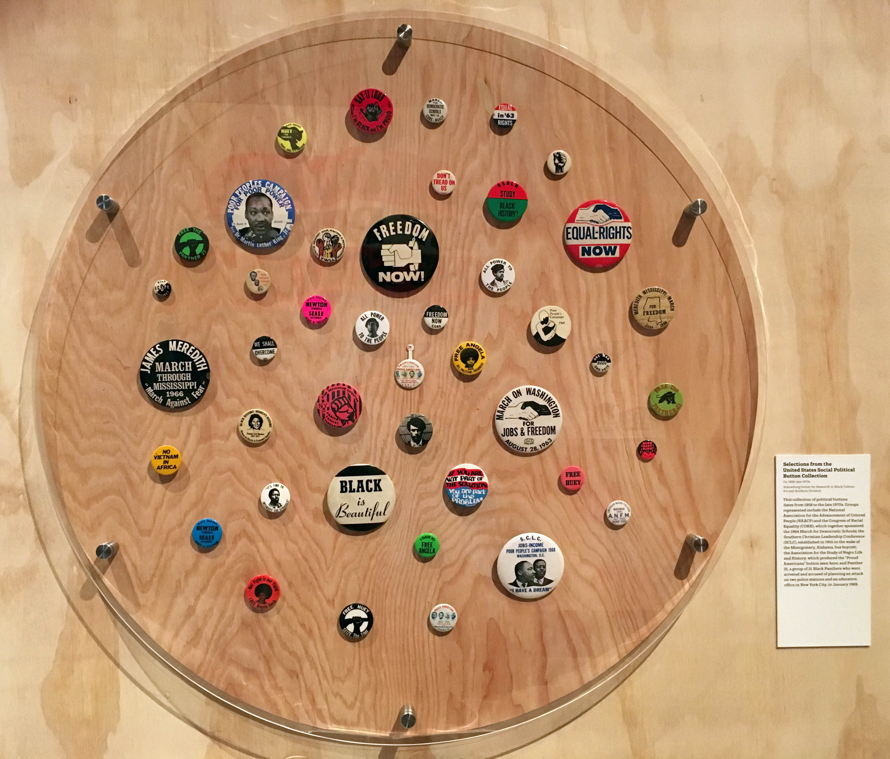
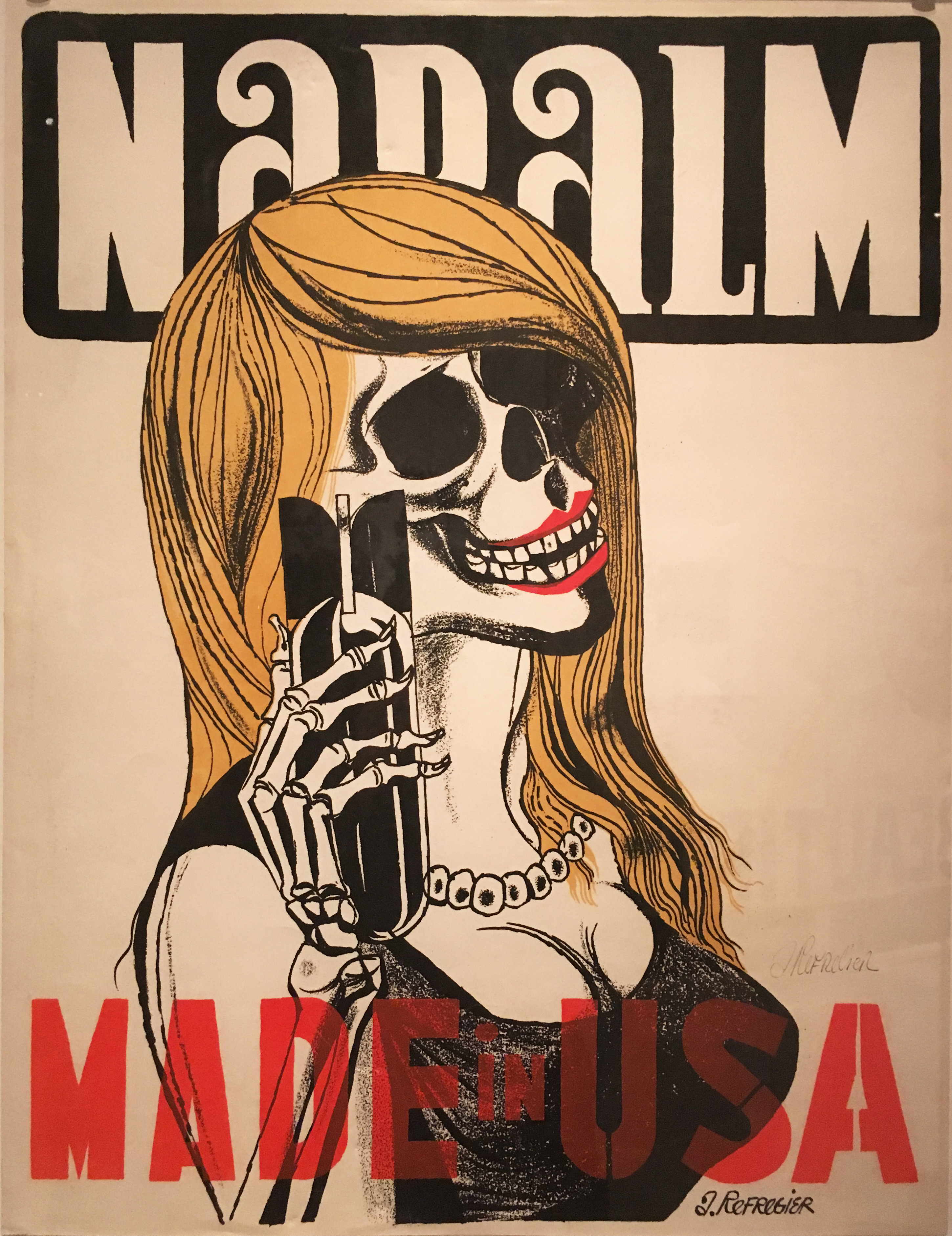
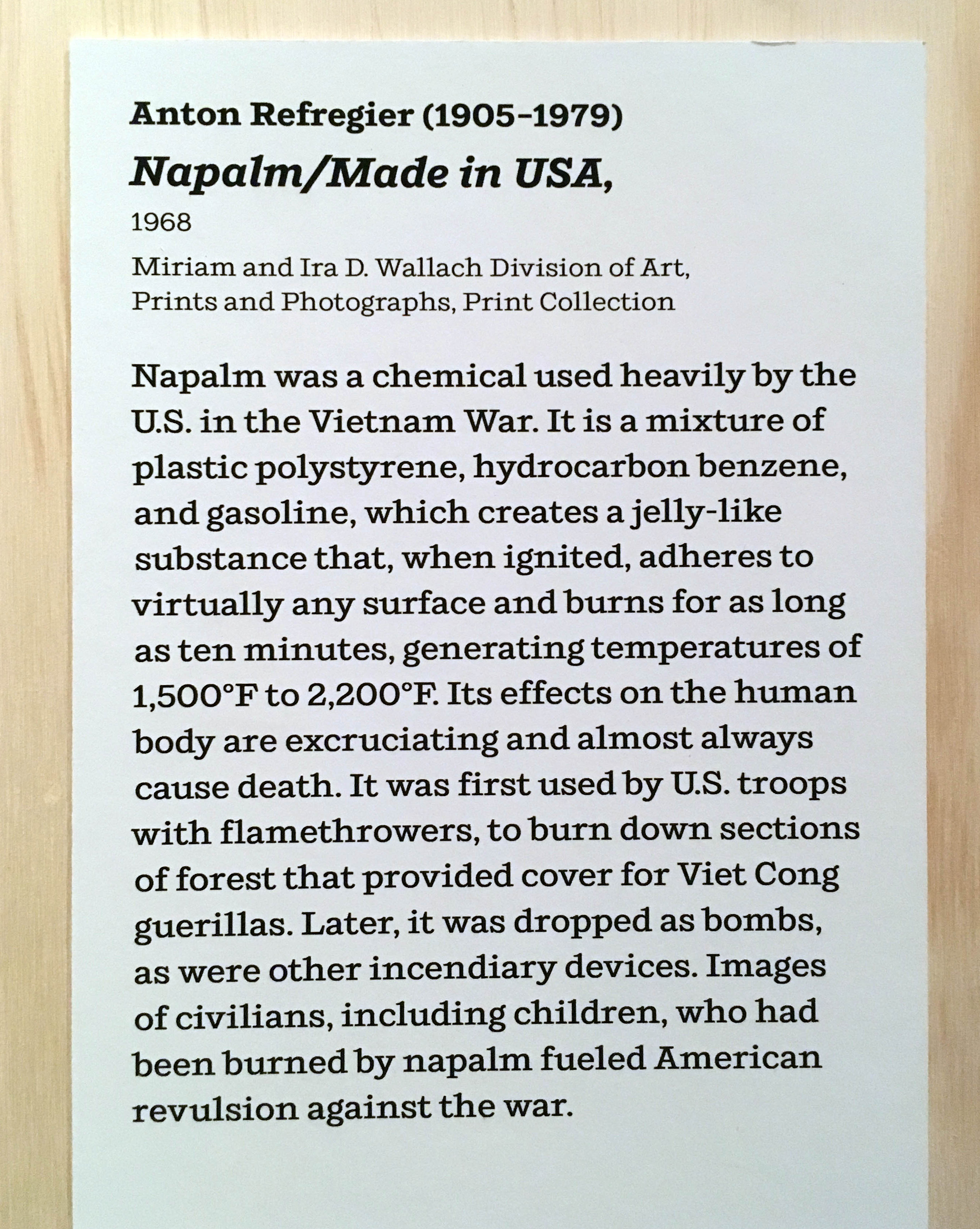
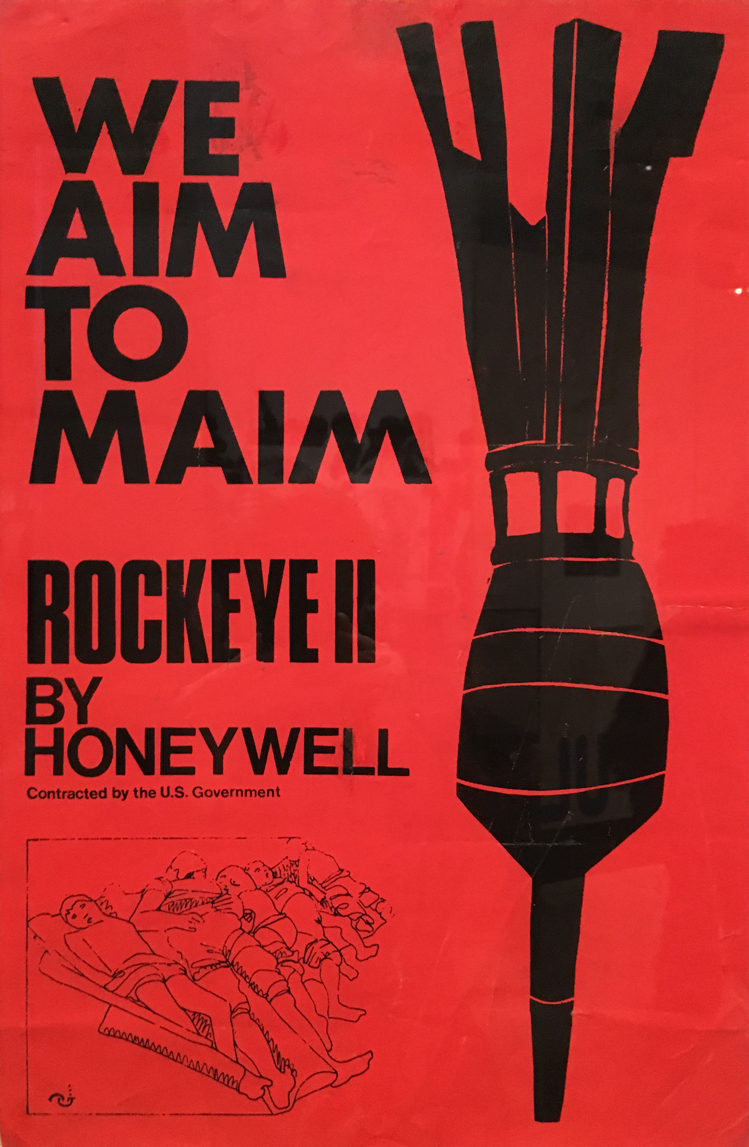
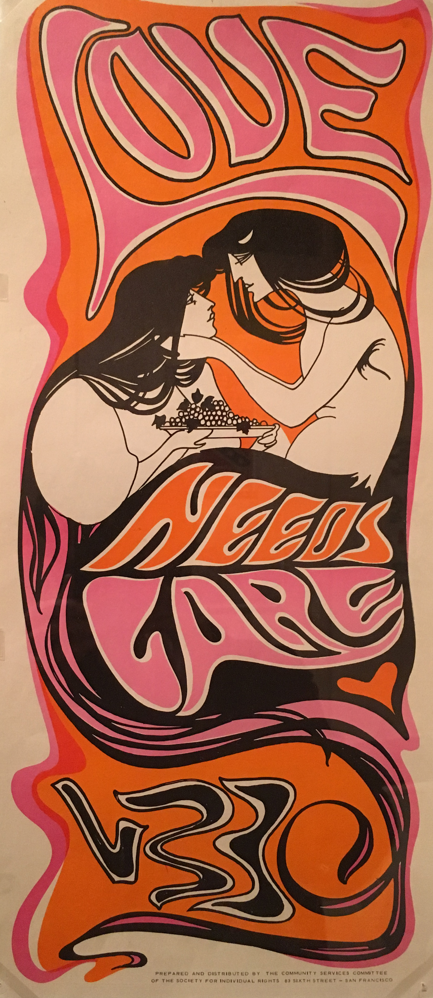
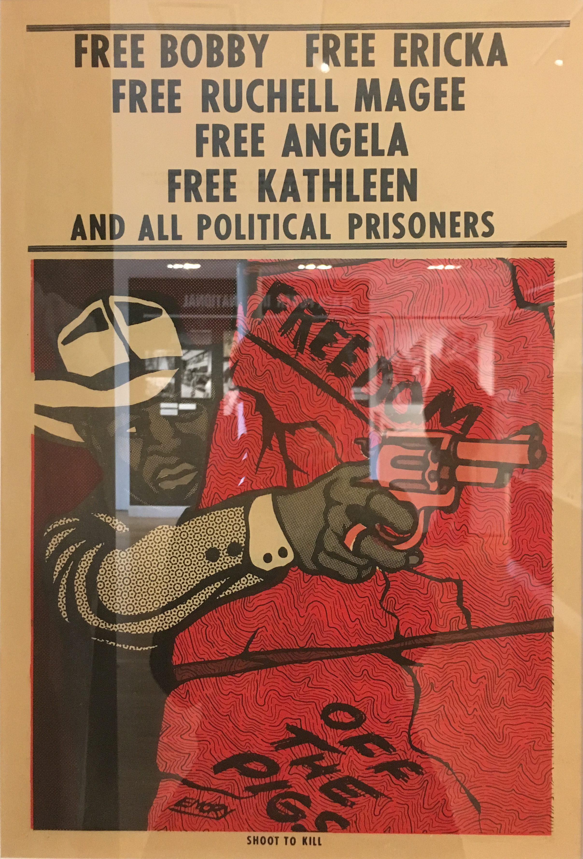
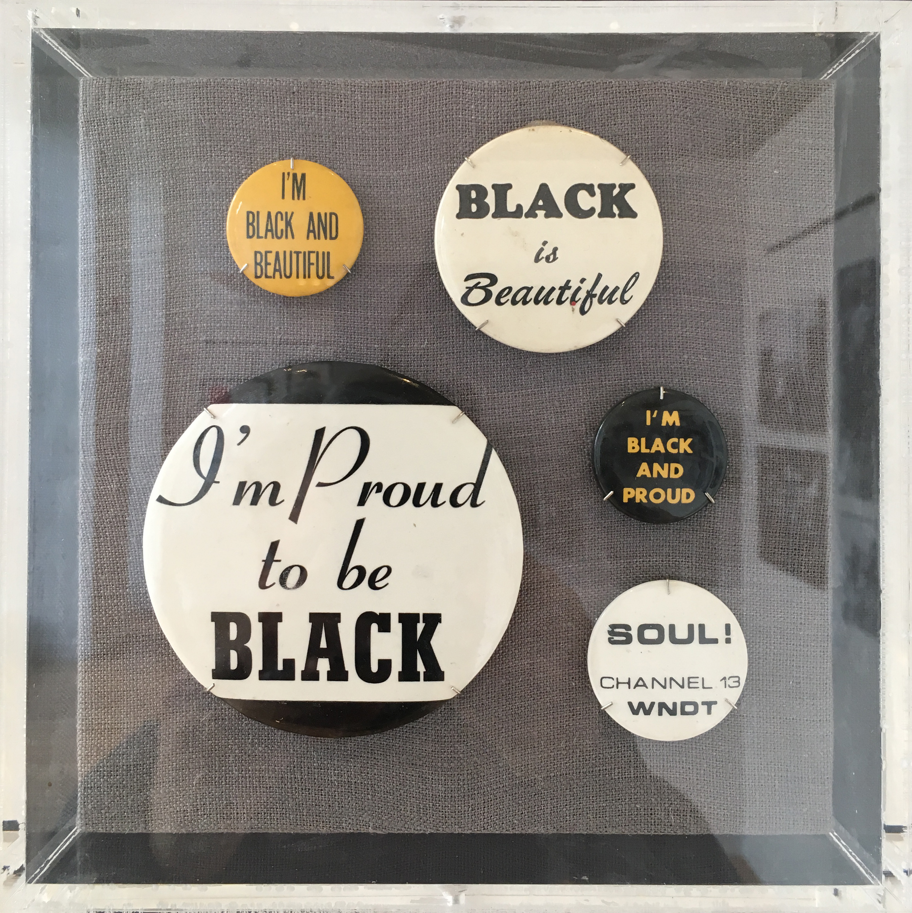
Black Power’s exhibition space at NYPL’s Schomburg Center was smaller, and much more didactic, but rich with documents of an undertold (and misunderstood) story of the Black Power movement. Graphics by Emory Douglas and many anonymous others mixed with letters, documents, photographs, and wall texts. (As Claire Bishop warned, this exhibition required a substantial time commitment for the ‘spectatorial labor’ involved in making sure to view and read every artifact.)

Exhibition design can give formal spatial disposition to abstract notions, as it did in the pavilions of the 1939 Fair. The 2017 Metropolitan Museum exhibition, Art of the In Between, was designed by fashion designer Rei Kawakubo in collaboration with the curator, Andrew Bolton; constructed by the Met; and dramatically staged by the lighting designer, Thierry Dreyfus. The Comme des Garcons fashion was exhibited in tableaux within distinct thematic enclosures.
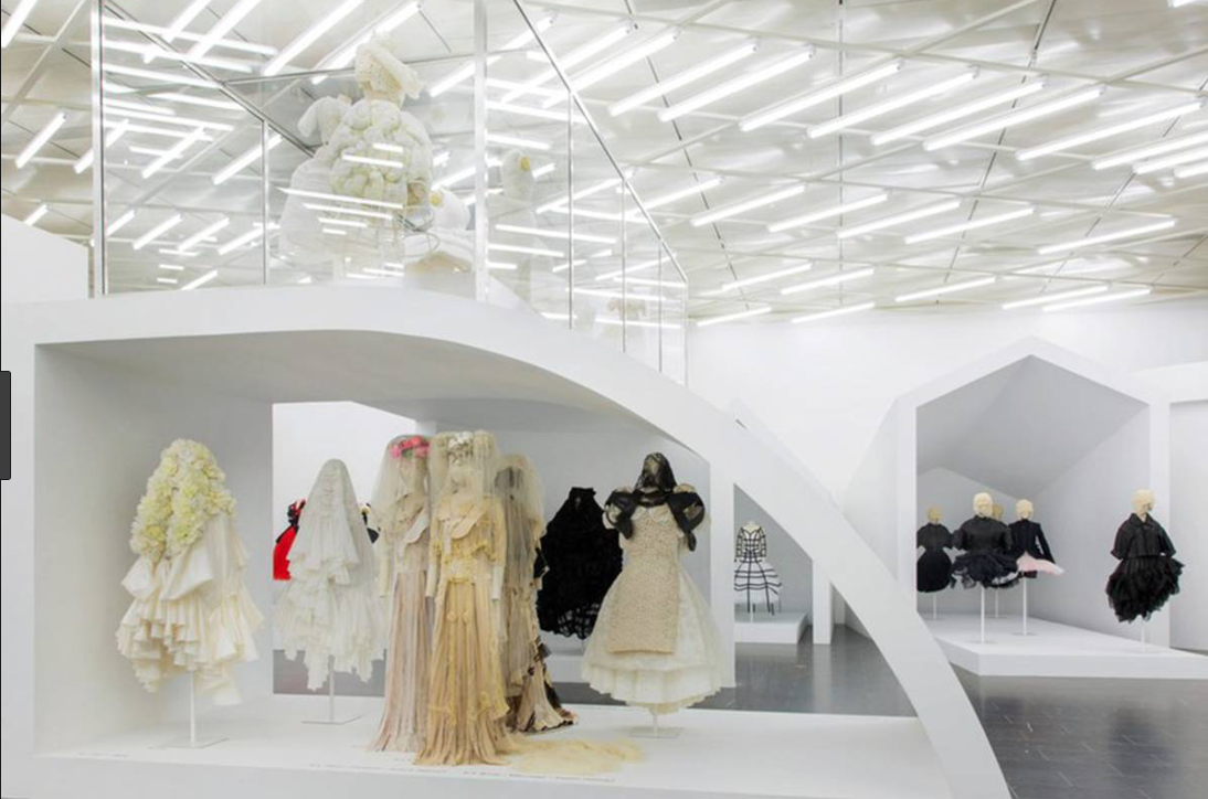
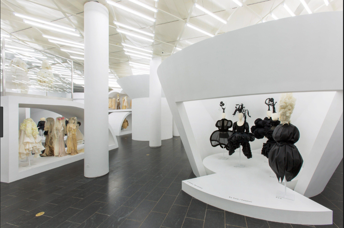
[From the Met exhibition website:] The thematic show features approximately 140 examples of Kawakubo’s womenswear for Comme des Garçons dating from the early 1980s to her most recent collection, many with heads and wigs created and styled by Julien d’Ys. The galleries illustrate the designer’s revolutionary experiments in “in-betweenness”—the space between boundaries.
Objects are organized into nine aesthetic expressions of interstitiality in Kawakubo’s work: Absence/Presence, Design/Not Design, Fashion/Anti-Fashion, Model/Multiple, Then/Now, High/Low, Self/Other, Object/Subject, and Clothes/Not Clothes. Kawakubo breaks down the imaginary walls between these dualisms, exposing their artificiality and arbitrariness.
Critical Practice
I’ve designed publications within the art world for over thirty years, much of it for artists engaged in overtly political work. This work’s critical gaze helps focus political and social issues into emotionally charged viewing experiences. The Social Realists likewise exposed the ominous events of their time as fascism threatened the world in late 1930s. I’m inspired by these artists who have happened upon, sought out, or been presented an archive to work with, and have emerged from the rabbit hole of research to successfully realize work. (This is a small selection of influences; I purposely leave a similar survey of critical graphic design practice out of the equation for the moment as I build this research repository.)
Communication of historical, political, and object research—from crafted form to data visualization—occupies an interpretive range between design and art practice. Formal typologies that both art and design share—and all of which are forms embodied in the 1939 World’s Fair include:
map / diagram / schematic
text / typography
model / tableau / scene
process / system
experience / performance
Map / Diagram / Schematic
Allighiero Boetti, Mappa, (1967–74, various). [Wikipedia:] Perhaps best known is Boetti’s series of large embroidered maps of the world, called simply Mappa. After the Six-Day War in June 1967 the artist began to collect newspaper covers featuring maps of war zones. Comprising twelve sheets of copper, each engraved only with the single outline of a map, Dodici forme dal 10 guigno 1967 (Twelve Shapes Starting from 10 June 1967) (1967–1971) graphically catalogues some of the world’s most serious political crises between 1967 and 1971, beginning, as its title suggests, with the territories occupied by Israel at the time of the Six Day War on 10 June 1967. He then asked his wife to embroider the shapes from the June 1967 map. The embroidery, consisting of three patches of brown wool on an otherwise empty piece of cloth, looks like a “work in progress”. Within a relatively short time he subsequently visited Africa, South America, the United States and East and Central Asia. He pondered the idea of the first large-scale Mappa during his second voyage to Afghanistan in 1971, resulting in a series of woven world maps entitled Territori Occupati. Between 1971 and 1979 he set up the One Hotel with his friend and business partner Gholam Dastaghir in Kabul as a kind of artistic commune and created large colourful embroideries, the most famous of these were the Mappa, world maps in which each country features the design of its national flag.
In 1971, Boetti commissioned women at an embroidery school in Kabul to embroider his first map. He initially intended to make only one but went on to commission roughly 150 of them in his lifetime, with no two possessing exactly the same dimensions. Boetti’s maps reflect a changing geopolitical world from 1971 to 1994, a period that included the collapse of the Soviet Union and the fall of the Berlin Wall. Embroidered by up to 500 artisans in Afghanistan and Pakistan, the maps were the result of a collaborative process leaving the design to the geopolitical realities of the time, and the choice of colours to the artisans responsible for the embroidery. The maps delineate the political boundaries of the countries; some nations, such as Israel, are not represented because the Taliban regime of Afghanistan did not then recognize their existence. When embroiderers ran short of a particular color thread and had to substitute another, oceans came out yellow or red instead of blue. In one map, the sea is unexpectedly coloured pink rather than blue, as landlocked Afghans had no tradition of mapping, certainly not of oceans.The border texts contain dates or details relative to the work’s production, Boetti’s signature and sayings, as well as excerpts from Sufi poetry.
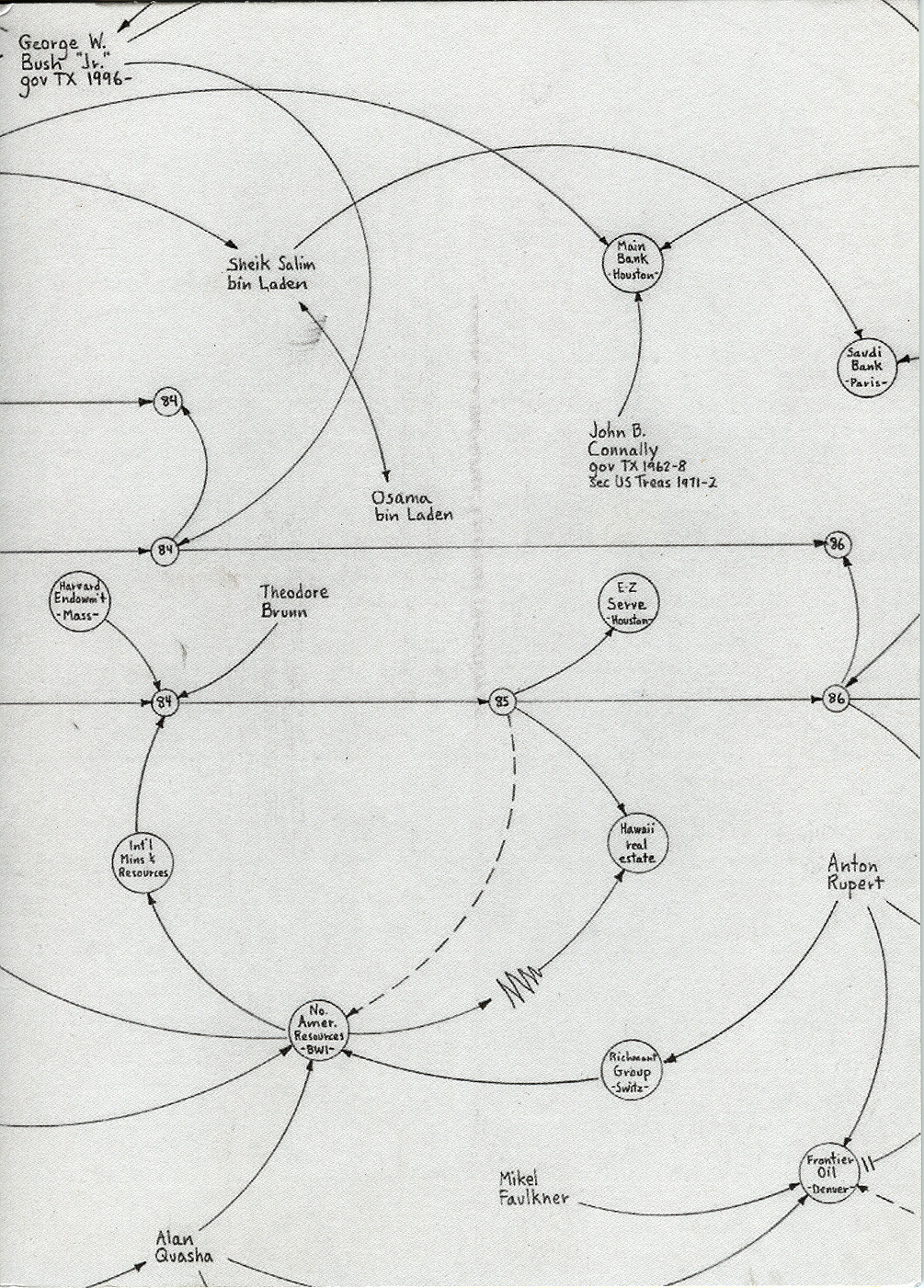
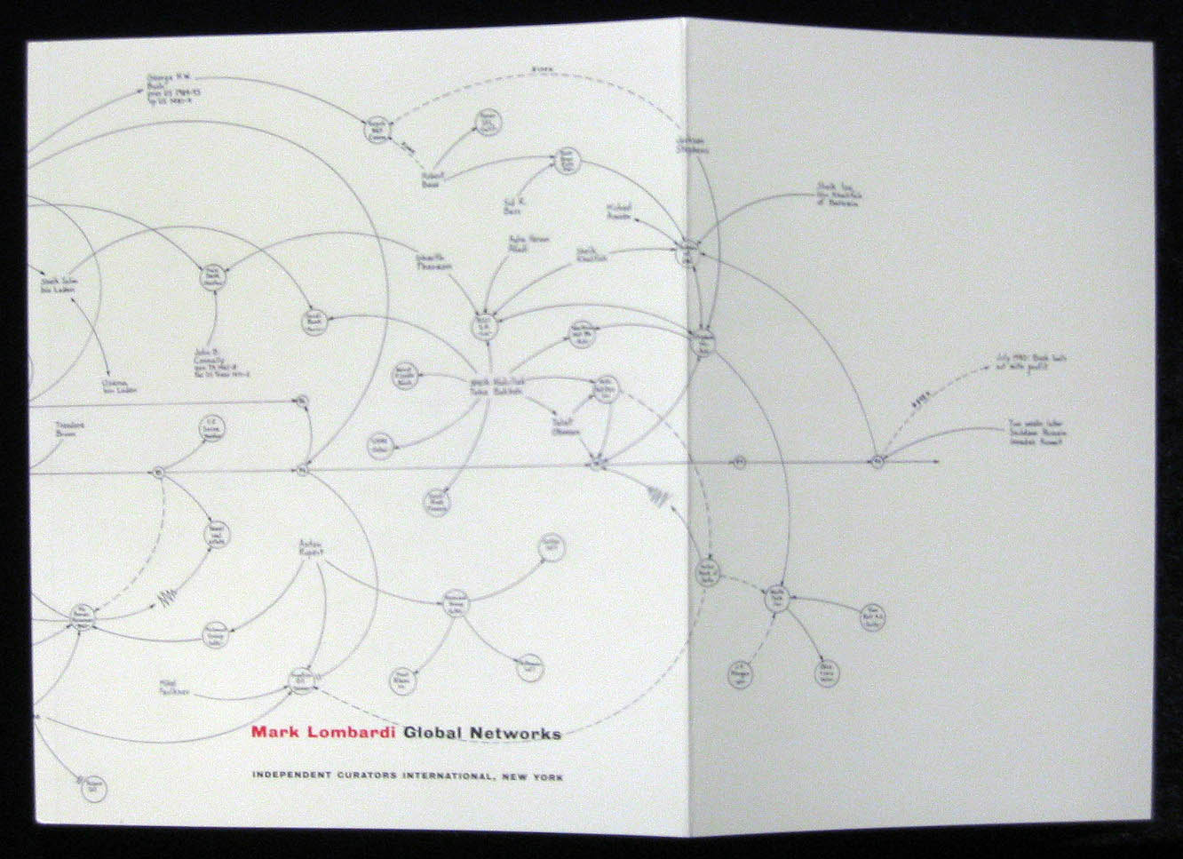

Mark Lombardi, Global Networks. [from John Hawke’s Brooklyn Rail review of the Drawing Center exhibition, 2004:] Each of the drawings is comprised of nodes of hundreds of person’s names, with the names of institutions inscribed within small circles. These points are connected by a lacework of delicately looping arrows, differentiated for different forms of interaction: vague influence, the transfer of money or assets, or a transaction that was somehow blocked. Sparse red pencil lines represent the friction of governmental or legal structures (fines, sanctions, or imprisonments) on the functioning of the conspiratorial network. The forms resulting from this logic resemble globes, explosions, diagrams of magnetic polarities orthe genealogy of locusts.
Each drawing, and its successive versions, is an attempt to explicate a particular scandal, such as “BNL,
Each drawing, and its successive versions, is an attempt to explicate a particular scandal, such as “BNL,
Reagan, Bush, & Thatcher and the Arming of Iraq,” or “Bill Clinton, the LippoGroup, and China Ocean Shipping Co., a.k.a. COSCO, Little Rock-Jakarta-Hong Kong, ca. 1990’s” (fifth version). In following versions, the network clusters grow and complexify, and like ionized particles, spring into new shapes. Each iteration of the subject diagrams a unique conjoining of interests, a molecule of fiscal chicanery. ...
Information graphics, as visual explanations of complex networks and processes, update Lombardi’s diagrams tracing world banking—the (possible) future of currency and its global flow is explained here: Bitcoin explained as Blockchain, as business, and as deregulated global network. The blockchain structure can even explain the art market itself.
Information graphics, as visual explanations of complex networks and processes, update Lombardi’s diagrams tracing world banking—the (possible) future of currency and its global flow is explained here: Bitcoin explained as Blockchain, as business, and as deregulated global network. The blockchain structure can even explain the art market itself.
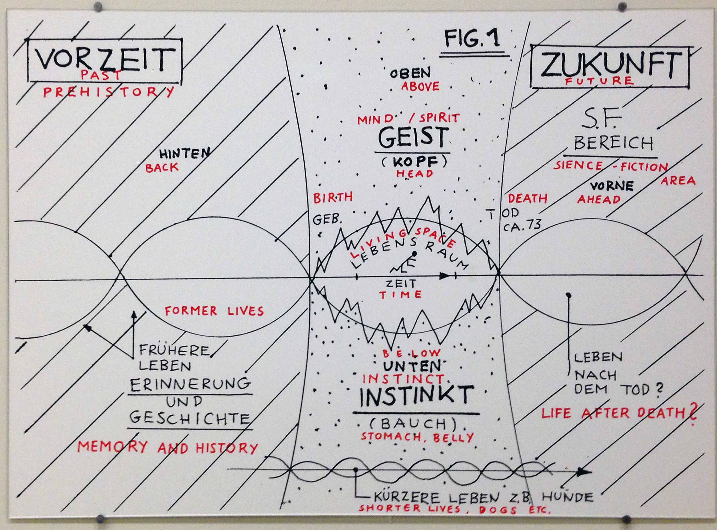
Philosophical diagrams from the Fischlii and Weiss Guggenheim Museum exhibition, How to Work Better. They use both diagram and model to whimsically speculate on the philosophical issues of everyday life.Diagrams and maps are meant to help us to understand abstraction, concept, and complex relationships. The Fair’s Theme and Democracity diagrams are earnest schematics; here they conjure the ineffable, the absurd, the humorous and ironic contours of pure theory.
(Below) Imminent war loomed in 1939; perpetual war is our current global condition. These three artists capture and freeze the physics of an explosion—and employ the trope of the ‘exploded diagram’—in sculptural form: Damian Ortega, Cornelia Parker, and Los Carpinteros.


(Below) Two views of a mobile made from cluster bombs at the COPE visitors’ centre, Laos, and cluster bomb shell and contents in bisected view, eerily evoking the shape of a coffin or mummy. This is one type of cluster bomb, a casing containing hundreds of small bombies or bomblettes. Dropped from the air, they spread to cover a large area. 80 million active bombies remained in Laos after the Vietnam war. COPE Vientiane is a non-profit organization in Laos which provides prosthetic limbs, mobility assistance and rehabilitation for Laotians who can’t afford it.


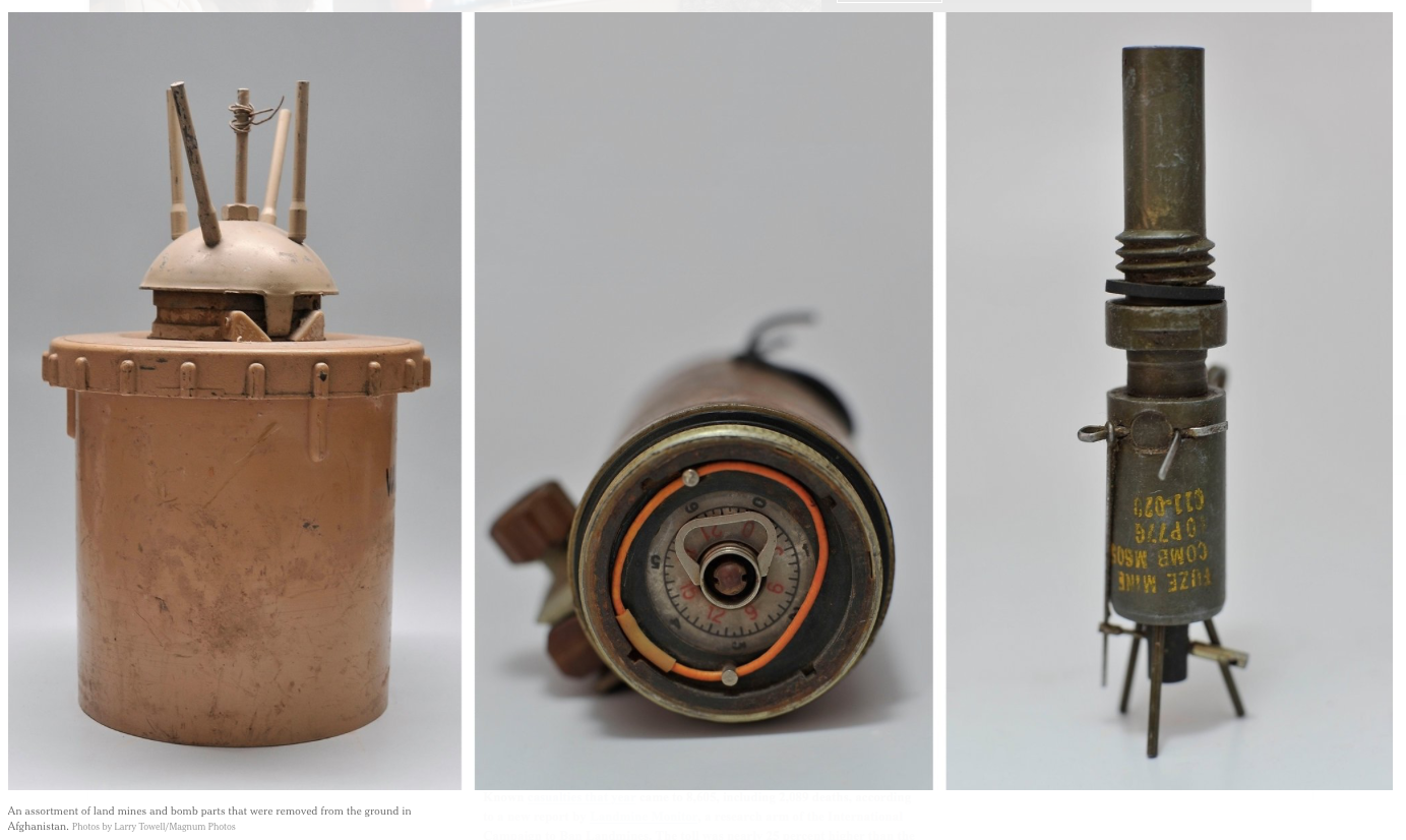
(left) An assortment of land mines and bomb parts that were removed from the ground in Afghanistan. Photos by Larry Towell/Magnum Photos. Duchamp’s readymades exposed the fine line between art objects, which help us interpret the world to reveal/make new meaning, and the physical objects of the ‘real’ world. Photographed as isolated objects, munitions and improvised explosive devices could well be seen as discrete sculptures. Art can (and should) provoke, and probe, these uncomfortable formal alignments.
Text / Typography
Doug Ashford’s collages from In the Abstract group show at Mass MoCA. Ashford counters politically charged events, timelines, and texts with a labyrinth of marks to bring the multiple readings of abstraction closer together (in the most direct of formal responses, considering politics and corporate power ‘in the abstract’). Ashford draws heavily from the New York Times as source (this research document’s links also lead primarily to NYT articles).
[from the artist’s bio] Collaboration is key to Doug Ashford’s extensive and varied art practice. Early in his career, from 1982 to 1996, he was a part of the artist collective “Group Material,” which treated curatorial practice and the exhibition itself as an artistic medium. The group considered “the display of art [as] a political event; making a place where what it means to be a human subject is
confirmed and debated.” Their participatory interventions dealt with the aesthetic manifestation of geopolitical themes, which later bled into Ashford’s independent practice. In his recent work, abstract swatches of paint or collage often intervene and obscure politically charged images and text, mined from mass media sources.

Wolfgang Tillmans, Pro-EU anti Brexit Poster Campaign, 2016. Installation view, Walker Art Center.
Photographer Tillmans extends his usual domain of the gallery space wall and edges fully into the realm of graphic design: type, image, message, and free downloadable posters from his website.
Allen Ruppersberg, Intellectual Property 1968–2018, Installation views, Walker Art Center, 2018. The artist draws from his vast archive of ephemera to appropriate printed forms and phrases.
Ruppersberg also delved into the Walker’s archive of past exhibitions and events, made simple laser copies, and situated items in space (a spatialzed ‘pavilion’ of the ephemeral); he represented his own studio space from photographs and books on display.
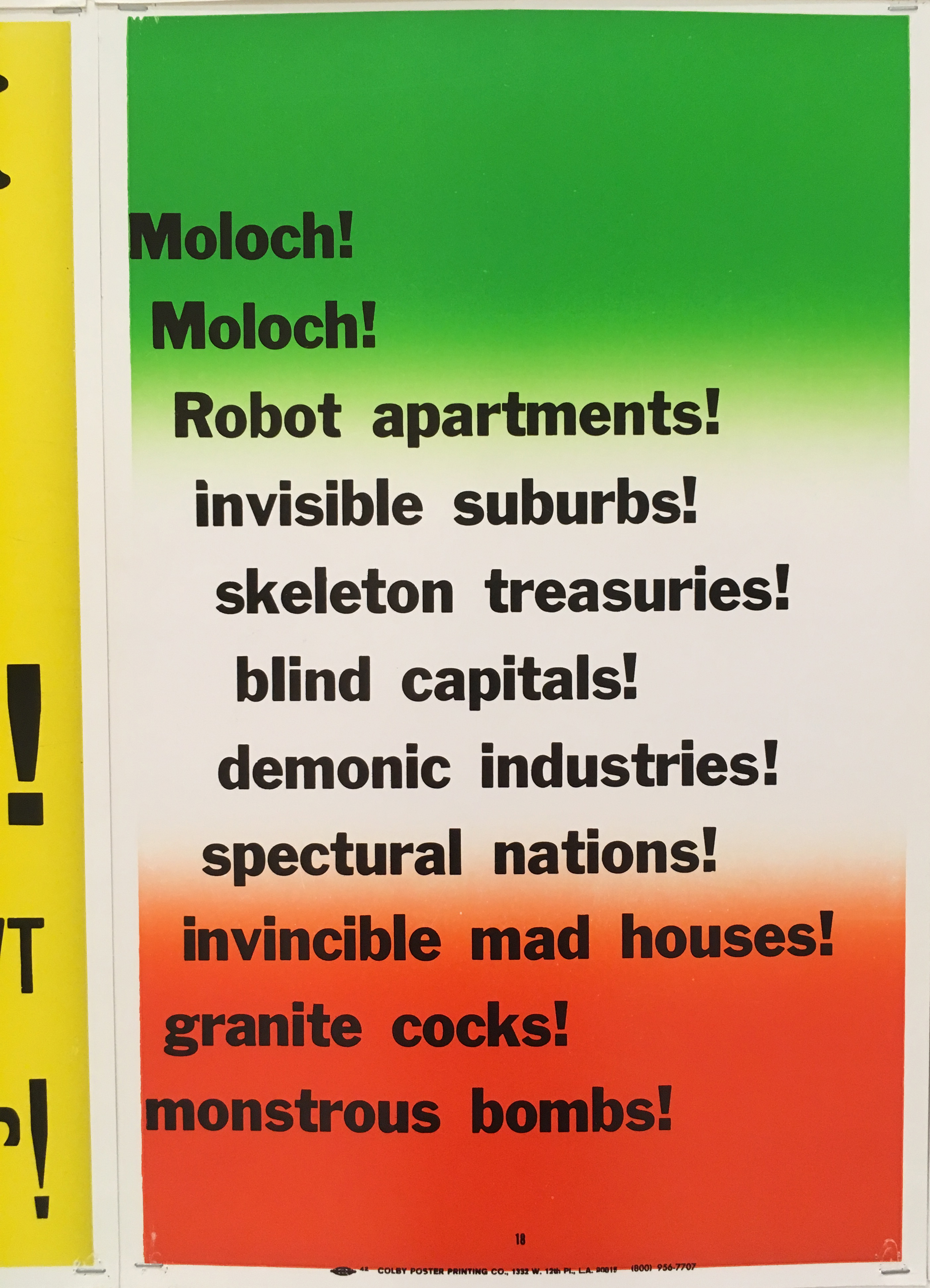
(The Fair’s ephemera offers multiple forms for translation and experimentation. Printing methods, type styles, and color extracted from 1939 Fair’s graphic materials could be reinterpreted for textual typographic images, such as:)
A Curious Perversion of Classical Precedent
The Retreat From Function
Strange as it Seems
Eyeglasses made of wood, cloth made of glass, and a talking flashlight that transmits sound on a beam of light
A Curious Perversion of Classical Precedent
The Retreat From Function
Strange as it Seems
Eyeglasses made of wood, cloth made of glass, and a talking flashlight that transmits sound on a beam of light
Model / Tableau / Scene
In City Dreams Bodys Izek Kingelez imagines a utopian model for the future world in the form of fantastic architectural scale models.

(From MoMA exhibition description)
“Without a model, you are nowhere. A nation that can’t make models is a nation that doesn’t understand things, a nation that doesn’t live,” said visionary artist Bodys Isek Kingelez (1948–2015). Based in then-Zaire (now the Democratic Republic of Congo), following its independence from Belgium, Kingelez made sculptures of imagined buildings and cities that reflected dreams for his country, his continent, and the world. Kingelez’s “extreme maquettes” offer fantastic, utopian models for a more harmonious society of the future.
“Without a model, you are nowhere. A nation that can’t make models is a nation that doesn’t understand things, a nation that doesn’t live,” said visionary artist Bodys Isek Kingelez (1948–2015). Based in then-Zaire (now the Democratic Republic of Congo), following its independence from Belgium, Kingelez made sculptures of imagined buildings and cities that reflected dreams for his country, his continent, and the world. Kingelez’s “extreme maquettes” offer fantastic, utopian models for a more harmonious society of the future.


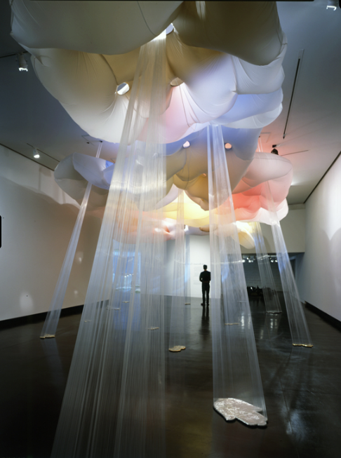
Lee Boroson works with materials to create immersive sculptural environments that engage nature and the manmade.
(From Mass MoCA Plastic Fantastic brochure) For Plastic Fantastic Boroson addresses the utopian ideas held by past generations about the shiny and new as symbols of the future. Through the transformation of materials like plastic, glass and fabric, Boroson emulates phenomenological experiences based on the most elemental forces in nature—from air, fog, and smoke, to fire and the cosmos. His installations are as much about creating an artificial environment as they are about building upon both historic and contemporary ideas, which challenge perceptions of landscape and the relationship between nature and the manufactured. For Plastic Fantastic Boroson addresses the utopian ideas held by past generations about the shiny and new as symbols of the future.
In Disarm Mechanized II (2012–14) Pedro Reyes sculpts firearms into mechanized musical instruments.
(From “‘Doomocracy’ Puts the Politics of Fear on Display in Brooklyn,” New York Times, Oct. 6, 2016)
The artist Pedro Reyes is a biting social critic whose pieces often hold out hope in the face of overwhelming evidence to the contrary—that things will get better. In “Palas por Pistolas” (“Shovels for Guns”), in 2008, he set up a program that allowed residents of Culiacán, Mexico, a city devastated by shootings, to trade in their guns for food stamps or household appliances; the guns, more than 1,500 of them, were melted down and turned into shovels.
The artist Pedro Reyes is a biting social critic whose pieces often hold out hope in the face of overwhelming evidence to the contrary—that things will get better. In “Palas por Pistolas” (“Shovels for Guns”), in 2008, he set up a program that allowed residents of Culiacán, Mexico, a city devastated by shootings, to trade in their guns for food stamps or household appliances; the guns, more than 1,500 of them, were melted down and turned into shovels.
Process / System
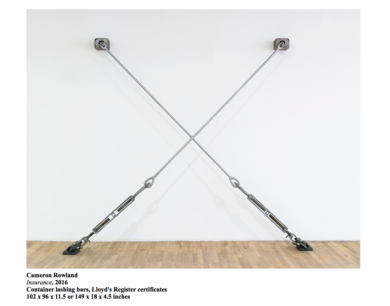
In 91020000, January 17–March 13, 2016 at Artists’ Space, NY, Cameron Rowland created an installation of objects and documents that were a material manifestation of systematic oppression and prison labor exploitation. He ordered and displayed Corcraft’s objects from court benches to uniforms to container lashing bars in Insurance; used to secure objects during transport on container ships, they evoke incarceration’s locks and restraints (and even the shackles used on ships during the slave trade).
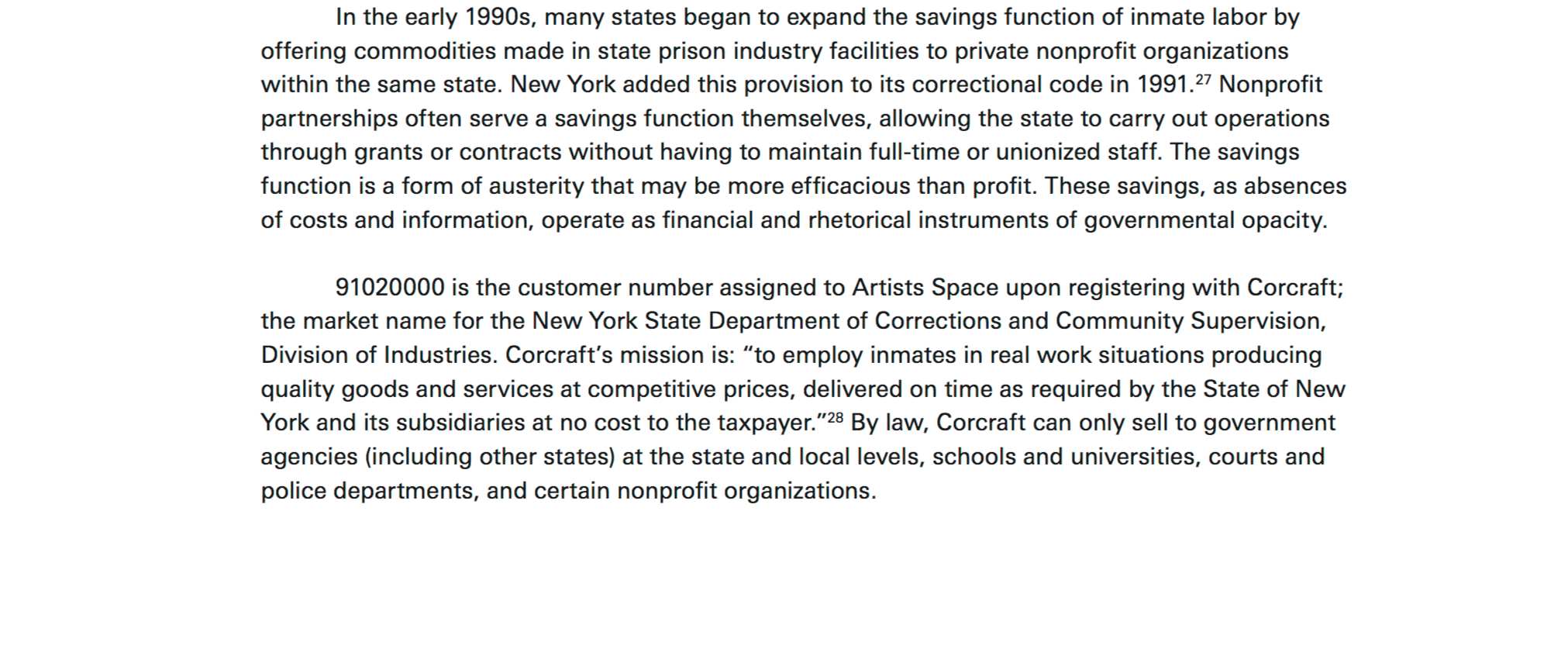

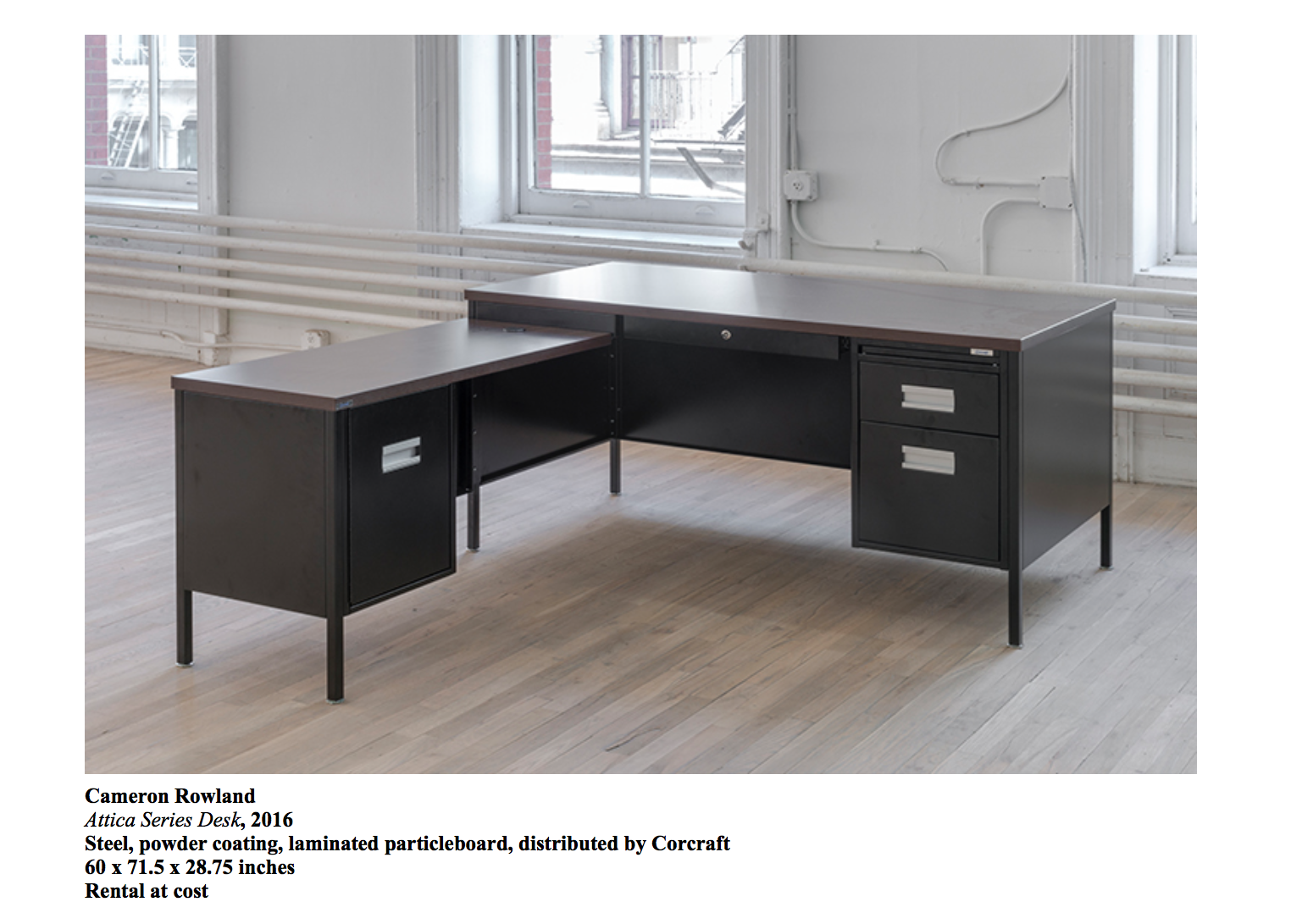
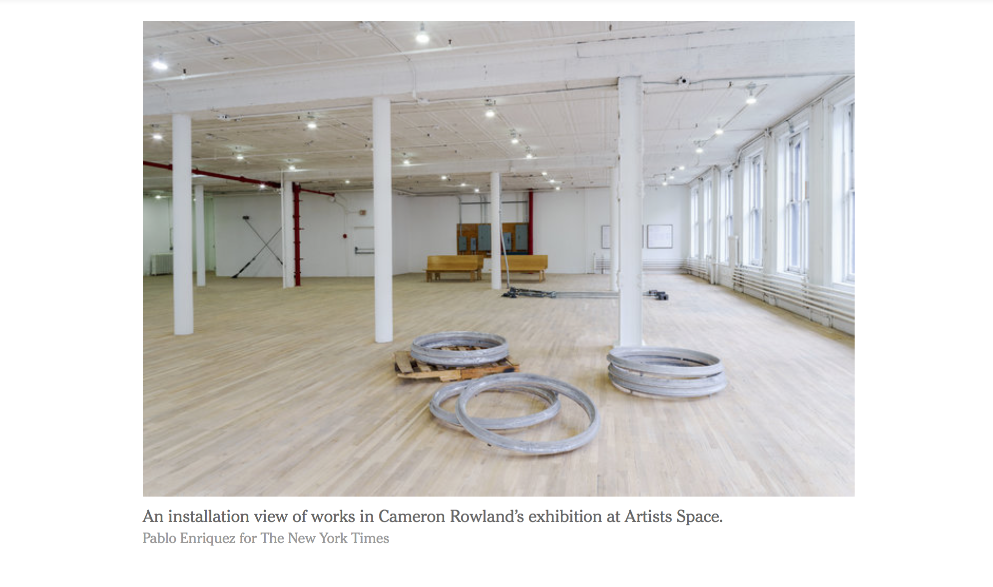
All pieces in the exhibition were commissioned by Corcraft and billed to Artists’ Space (as a qualifying NY State non-profit). This means the ‘sculpture’ in the installation (such as this set of court benches) are actual products crafted by NY State inmates, essentially as a kind of slave labor. From the exhibition’s downloadable pdf: The state-use of prisoner labor does not result in publicly traded profit, but rather in savings. The savings function of the neoliberal state is a reflection of governance modeled after business. In New York State, inmates provide savings on the basis that they are paid $0.10 to $1.14 an hour. ...These savings, as absences of costs and information, operate as nancial and rhetorical instruments of governmental opacity.
Harun Farocki utilizes a vast collection of image sequences from laboratories, archives and production facilities to explore modern weapons technology. This trilogy examines “intelligent” image processing techniques such as electronic surveillance, mapping and object recognition, in order to take a closer look at the relationship between man, machine, and modern warfare. His art is a meditation on the degree to which our world, what we take for reality, is formed by recording and image-making machinery. We are always “at a distance,” in peace as well as in war. Representational technology becomes an experience in and of itself, whichat least partly eclipses what it purports to reveal. Similarly, our minds organize incoming information into images and narratives that may or may not be true to the facts.—Ken Johnson, Unfiltered Images, Turning Perceptions Upside Down, New York Times, August 26th, 2011
Stills from Eye Machine I, Eye Machine II, Eye Machine III
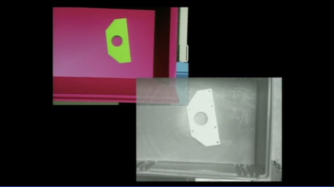
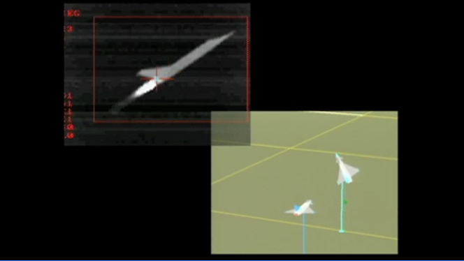


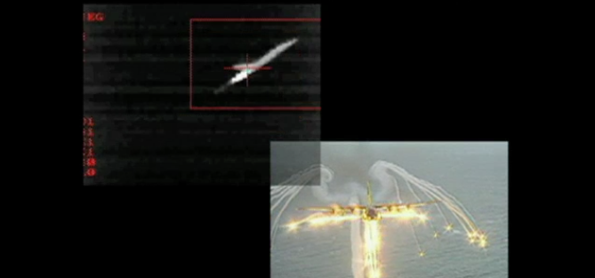
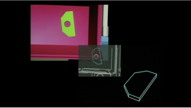
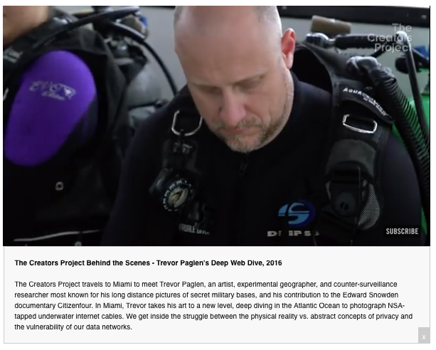
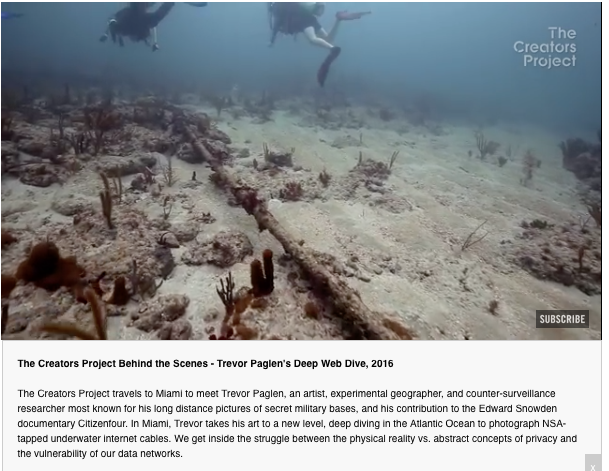
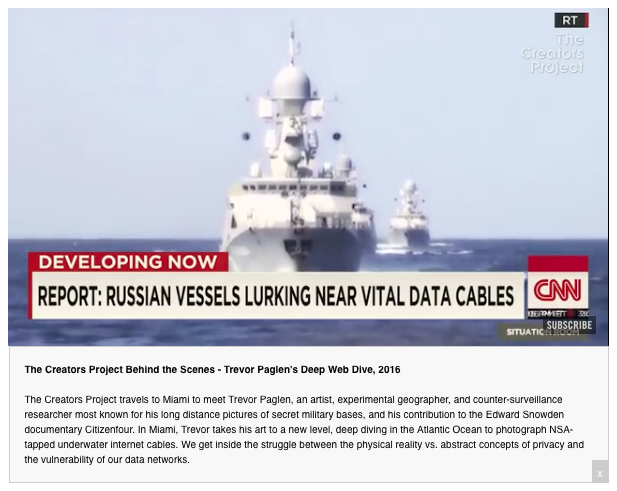
In Deep Web Dive, Trevor Paglen takes a group of curators and writers with him to locate the source of worldwide internet connection—the physical cable at the bottom of the ocean. In all his work, Paglen turns the gaze of surveillant technology and machine vision back on itself, making visible the invisible in multiple narrative forms.



Experience / Performance
Multiple critical responses to a central theme can culminate in temporal form, such as an event or symposium. The Shape of Things was organized by artist-in-residence Carrie Mae Weems at the Park Avenue Armory, NYC, as part of its Conversations: Interrogations of Form series in December, 2017. On the theme of ‘the history of violence,’ readings, lectures, films, performances, dialogues, and conversations took place throughout the cavernous Armory space, concurrently occupying warrens of rooms and allowing viewers multiple experiences (regrettably, at the expense of missing others at this remarkable day long event).
(below) Event program as newsprint multiple; Tania Bruguera performing 1-hour reading of Trump’s Twitter feed from his first day in office; still from Navid and Vassiliki Khonsari’s video game based on the 1979 Iranian revolution; The Wooster Group, featuring Eric Berryman’s interpretive rereading of “Negro Folklore from Texas State Prisons.”

There are many more artists who I consider to operate in a hybrid zone between art and design: Taryn Simon, Mona Hatoum, and Walid Raad are only a few of the growing list of additions to this pantheon of influences that suggest visual and methodological approaches to the interrogate the World’s Fair archive.
The Fair was a spectacle of performance and staging, as well as propogating troves of graphic and textual material. For work inspired by an ephemeral primary-source object/text, “The Guiness Book of World Records,” see Sam Green’s The Measure of All Things, an almagamated spoken-word/projected-film/musically-scored live-documentary performance focused on subjects/stories peripheral to the book’s primary accounts of record-breaking characters. Green’s creative practice is a wonderful example of merging multiple methods and material into a compelling narrative form.
Others from the world of theater who work with inventive historical reframings and multimedia staging include The Builders Association and Elevator Repair Service. Elevator Repair Service has frequently collaborated with data artist and designer Ben Rubin of the Office for Creative Research (OCR), an exemplary multifaceted practice creating vibrant narrative through dynamic display of complex information.
The web invitingly allows for multiple narratives, including film, interactive time elements, texts, and other media—and can grow and change over time. A wonderful example of a complex web-based documentary is Cold Storage, produced by Harvard metaLab and Jeffrey Schnapp, a profile of the Harvard Library Annex as site by using interactive diagram, film, video, and text.
The New York World’s Fair’s node and edge relationships are complex—within the context of 1939–40, but even moreso as we reconsider their parallels today. Complexity, however, can risk incoherence of form. Philosopher Tom Whyman in Theresa May, Britain’s Kafkaesque Prime Minister (NYT, Jan. 15, 2019) imparts this cautionary wisdom:
“At first glance it looks like a flat star-shaped spool for thread,” the narrator claims in The Cares of a Family Man, Franz Kafka’s brief, haunting story in which Odradek appears. But as the narrator’s hesitant, circuitous description continues, it becomes clear that Odradek, in fact, has no intelligible shape whatsoever. “One is tempted to believe” that Odradek used to be part of some greater, coherent whole, of which he now remains as a “broken-down remnant.” But, the narrator admits, this does not really seem to be the case, and “the whole thing looks senseless enough, but in its own way perfectly finished.”